


Originally published on Brookings.edu
2023 will be the year with the highest emissions ever recorded, according to new projections from the World Emissions Clock put out by the nonprofit arm of World Data Lab. The world is expected to emit almost 59 Gigatons of carbon-equivalent greenhouse gases; about 2,000 tons per second. The global average citizen now emits around 7.4 tons of these emissions, which can be disaggregated into 2.7 tons for energy, 1.8 tons for industry, 1.5 tons for agricultural production and land-use change, 1 ton for transport, and 0.4 tons for heating and cooling buildings (see Figure 1). This trend of growing emissions means that current levels are now about one-third higher than the levels that would have limited global warming to 1.5 degrees had an appropriate global program been put in place in 2021. This means that per capita emissions need to come down to below 5t per capita over the next decade and move towards 2.5t by 2040.
Figure 1. In 2023, an average global citizen will emit 7.4 tons of GHGs
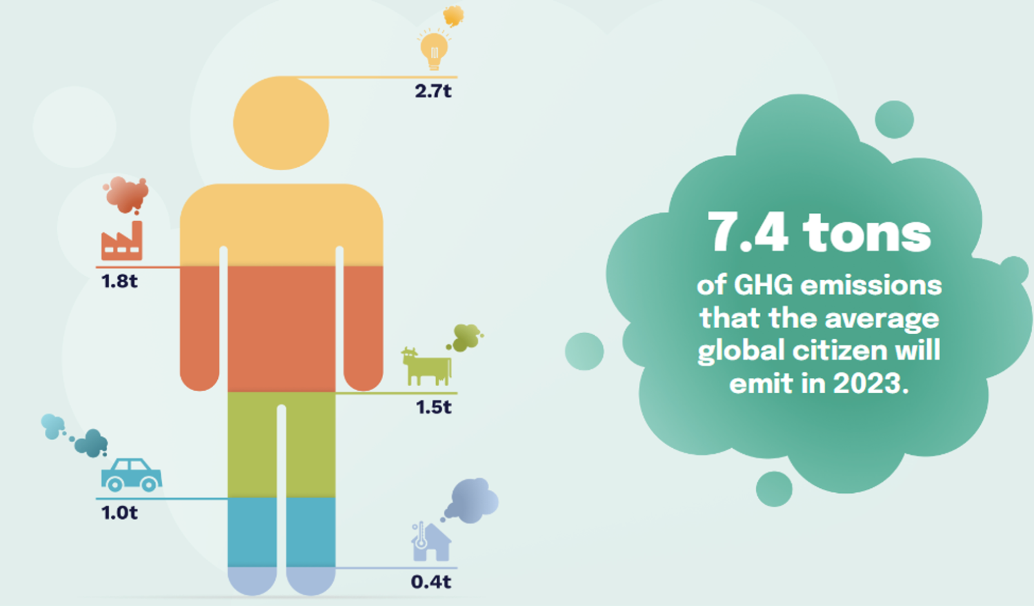
Source: World Data Lab, World Emissions Clock
There is, nevertheless, some good news in the projections. If countries deliver on the promises made in their Nationally Determined Contributions, 2023 will also go down in history as the year that global carbon emissions peaked. The velocity of change may be too slow and uneven across countries, but recent experience shows that change towards a low-carbon economy is technologically and economically feasible. As countries meet at COP 28, it is worth understanding their very different starting points and trajectories. The map below divides countries into three categories—each country is color-coded to indicate whether its 2023 per capita GHG emission level is high, medium, or low. The bold/muted color distinctions further indicate whether the trend is increasing or decreasing.
Figure 2. Classifying countries by greenhouse gas emissions per capita in 2023
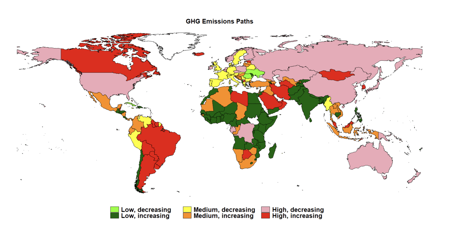
Source: World Data Lab, World Emissions Clock
The most significant information portrayed in the map is that almost all of the Northern Hemisphere as well as Australia and New Zealand are now seeing a decline in emissions, the only exceptions being Canada, Mongolia, and South Korea. Importantly, this group now includes China and the United States for the first time, the two largest emitters in aggregate in the world. Most of Europe, already a medium-level emitter, is making further progress towards decarbonization, as is Japan. Altogether there are now 42 countries, responsible for well over half the world’s emissions, that are on a path of steadily declining emissions, up from 36 last year. Along with China and Japan, newcomers in this group include Australia, Kazakhstan, Portugal, and Peru.
The data in the map is summarized in Table 1 below. The net-zero challenge can be conceptualized as how to concentrate countries in the top left segment of the table—low emitters on a declining trend. There are only 4 countries (out of 180 on which data is readily available) in this category now. The priority is to get the 52 high-emitting countries to decrease emissions as rapidly as possible. These countries account for two-thirds of global emissions. Israel and Serbia are setting an example by moving from high emitters to medium emitters since last year.
Table 1. The emission reduction challenge: Number of countries with declining and increasing emissions
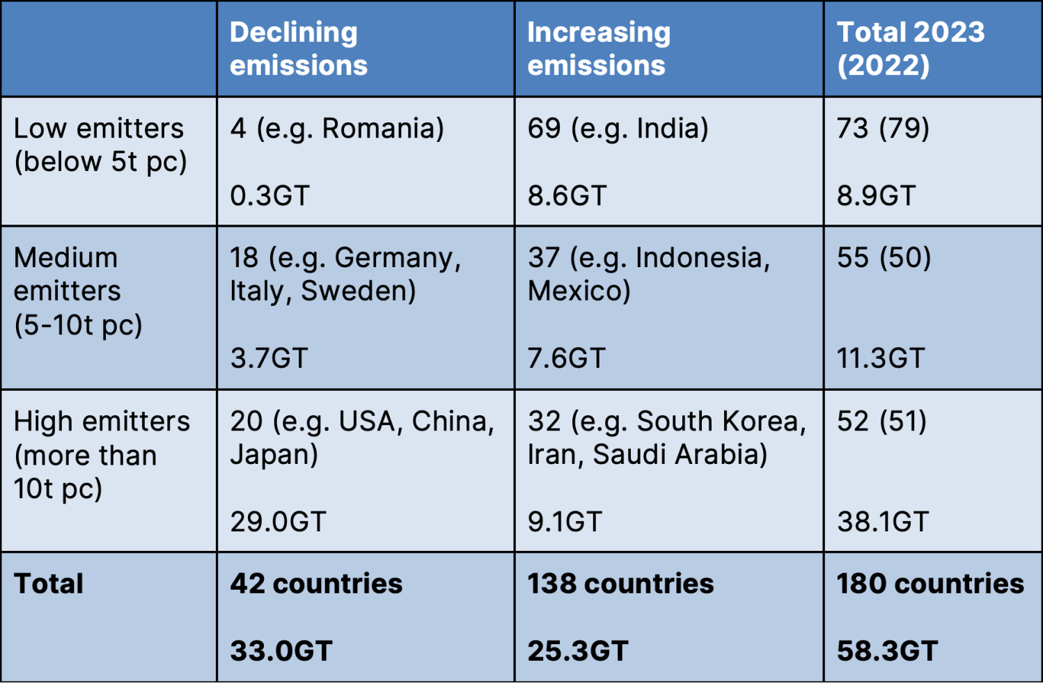
Source: Author’s calculations based on: World Emissions Clock
Countries with decreasing emissions are putting two myths to rest. First, they are showing that economic growth can be decoupled from higher emissions. The United States, for example, will likely grow by over 2% this year, while emissions decline. Similarly, China may achieve 5.4% growth with a small decline in emission levels. The second myth is that policies, especially those targeting high-emitting sectors, are not important. The countries showing a decline in emissions are those that have invested heavily in renewable energy sources and in electric vehicles, among other improvements.
Countries with decreasing emissions are putting two myths to rest. First, they are showing that economic growth can be decoupled from higher emissions.
Another important takeaway from the map is that almost all developing countries are increasing their per capita emissions of GHGs. As a group, developing countries (ex-China) now account for over 40% of global emissions. Without progress in these countries, there is little chance for the world to achieve its 1.5-degree target. Most developing countries, of course, are starting from a very low base, so an increase in emission levels is neither surprising nor unjust. But even these countries can contribute more to global efforts, especially if supported by the international community.
In many developing countries, the rise in emission levels is linked with changes in their land use, partly to satisfy demand for agricultural products in foreign countries. Deforestation to free up land for farming is a particular problem in the Congo, Papua, and Amazon forest basins, although for the latter there has been encouraging progress in reducing deforestation rates in 2023. But here too, there are role models of countries that have successfully managed their forest—such as Romania and South Korea. The latter, for example, has initiated strong reforestation programs in past decades, which, together with more sustainable farming practices, make the agriculture sector an overall sink for GHG emissions.
A clear comparative framework such as the one above provides information on progress over time and on comparisons across sectors. In order to reach a net-zero world, all countries have their part to play. But countries with the highest current per capita emission levels have a responsibility to reduce emissions the fastest.
